The identity centers on a distinctive wordmark: a dialogue between lowercase letters and a singular uppercase O.
Inside the O, the word 'coffee' anchors the brand’s meaning.
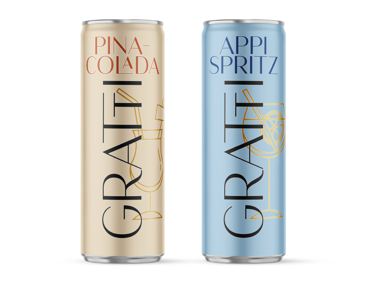
Packaging extends the idea with a clean, restrained system — minimal color, bold typography, and subtle metallic accents — evoking both everyday ritual and precious value.
